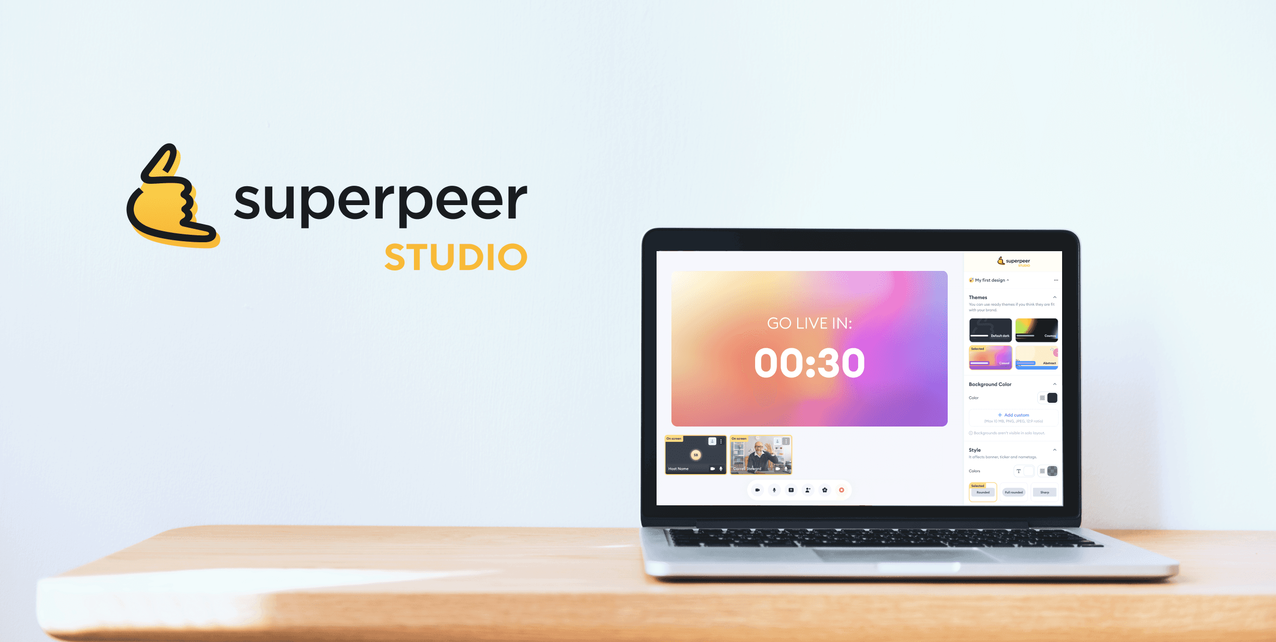
Superpeer Studio: How I became a strategic partner by bringing stakeholders together to shape the product
Company
Superpeer
My role
Product designer, strategic facilitator between teams, UX observer in live broadcasts
Read duration
5 minutes
Before dive in..
In case you want a relaxing song to go with this story, I’ve got you covered. ✨
In case you want a relaxing song to go with this story, I’ve got you covered. ✨
🧩 Overview
Superpeer Studio enables hosts to engage with their audiences. But limited customization made it hard for them to reflect their brand. I was tasked with exploring new features to solve this.
Superpeer Studio enables hosts to engage with their audiences. But limited customization made it hard for them to reflect their brand. I was tasked with exploring new features to solve this.
🚧 Where I failed — and what I learned at the very beginning of the process
Where I failed: I started the project by jumping straight into Figma and generating ideas, without first involving stakeholders. I ended up spending too much time on detailed UI solutions before fully understanding the problem space.
What I learned: you can’t design in isolation — especially when business goals aren’t clearly aligned and user needs haven’t been fully uncovered.
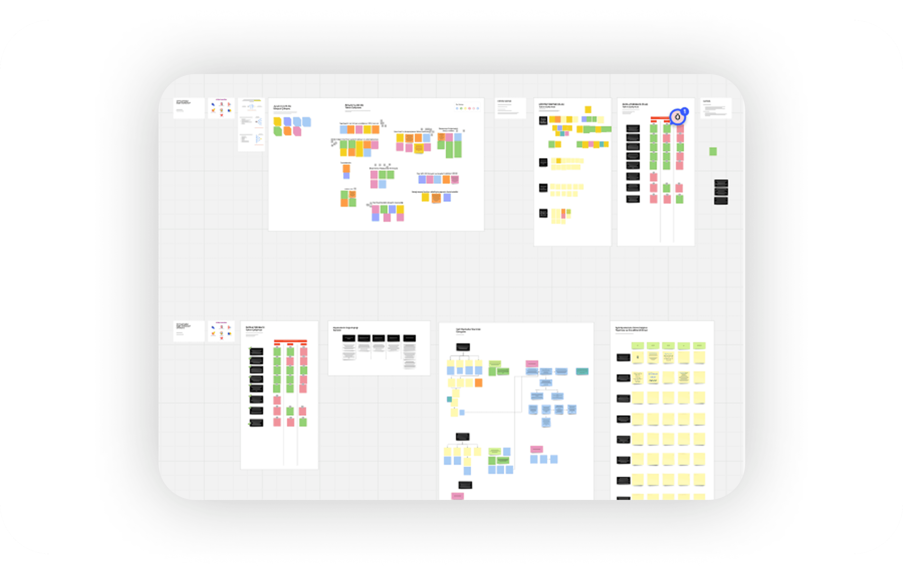
How I solved it: First, we needed to understand which features users actually needed. So I designed and led a "Discovery" session where all stakeholders could collaborate and align on the right direction.
Where I failed: I started the project by jumping straight into Figma and generating ideas, without first involving stakeholders. I ended up spending too much time on detailed UI solutions before fully understanding the problem space.
What I learned: you can’t design in isolation — especially when business goals aren’t clearly aligned and user needs haven’t been fully uncovered.
How I solved it: First, we needed to understand which features users actually needed. So I designed and led a "Discovery" session where all stakeholders could collaborate and align on the right direction.
🎥 Field observation: live broadcasts
I joined several live sessions as an audience to understand real-time struggles. This is where I uncovered a key insight: the relationship between host and viewer felt one-sided and disconnected.
This led me to ask:
“How might we build stronger emotional bridges between hosts and their audiences?”
I joined several live sessions as an audience to understand real-time struggles. This is where I uncovered a key insight: the relationship between host and viewer felt one-sided and disconnected.
This led me to ask:
“How might we build stronger emotional bridges between hosts and their audiences?”
Discovery session with stakeholders
💥 My impact
I brought together team leads from product, marketing, and engineering.
I conducted hypothesis mapping workshops.
I gathered business goals and KPIs to align the team around a shared direction.
🤝 What we did together
We reviewed and discussed incoming tickets to spot recurring themes.
We prioritized ideas using an impact–effort matrix to focus on high-value opportunities.
🚀 The outcome
Our goal was to create a more customizable broadcasting experience — one that allows hosts to better express their brand and connect with their audiences.
To support this, we focused on features like:
Adding intros and outros to streams
Customizing themes and backgrounds.
Displaying audience questions directly on screen.
Adding intros and outros to streams.
“Before we design, we need to understand what success looks like — from everyone’s perspective.”
💥 My impact
I brought together team leads from product, marketing, and engineering.
I conducted hypothesis mapping workshops.
I gathered business goals and KPIs to align the team around a shared direction.
🤝 What we did together
We reviewed and discussed incoming tickets to spot recurring themes.
We prioritized ideas using an impact–effort matrix to focus on high-value opportunities.
🚀 The outcome
Our goal was to create a more customizable broadcasting experience — one that allows hosts to better express their brand and connect with their audiences.
Displaying audience questions directly on screen.
Customizing themes and backgrounds.
Adding intros and outros to streams.
“Before we design, we need to understand what success looks like — from everyone’s perspective.”
💥 My impact
I brought together team leads from product, marketing, and engineering.
I conducted hypothesis mapping workshops.
I gathered business goals and KPIs to align the team around a shared direction.
🤝 What we did together
We reviewed and discussed incoming tickets to spot recurring themes.
We prioritized ideas using an Impact–Effort matrix to focus on high-value opportunities.
🚀 The outcome
Our goal was to create a more customizable broadcasting experience — one that allows hosts to better express their brand and connect with their audiences.
To support this, we focused on features like:
Adding intros and outros to streams
Customizing themes and backgrounds.
Displaying audience questions directly on screen.
Adding intros and outros to streams.
“Before we design, we need to understand what success looks like — from everyone’s perspective.”
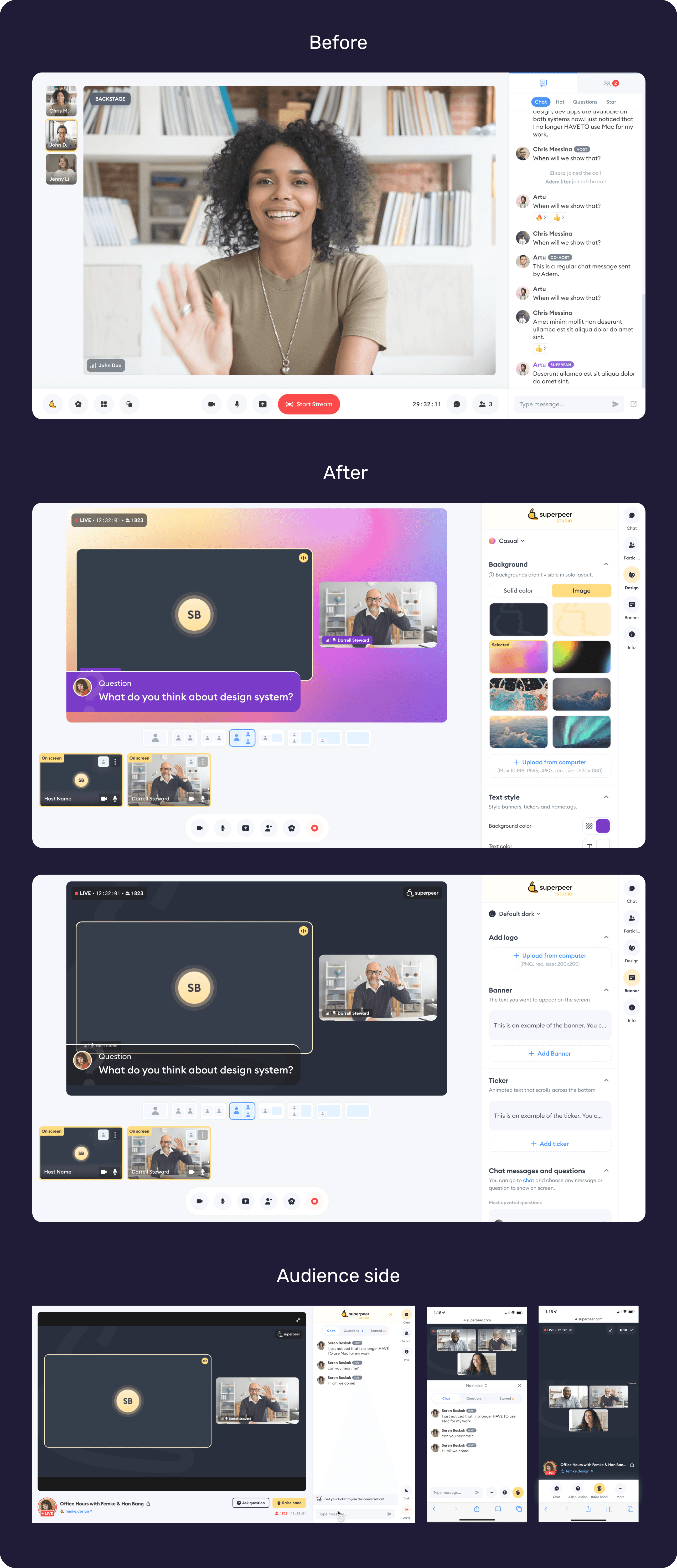
✨ Key Improvements
I added a personalization section within the existing panel, allowing hosts to customize themes and backgrounds to reflect their brand.
I designed an experience that allows hosts to instantly display chat messages ending with a question mark on screen — supporting stronger interaction between the host and the audience.
By repurposing the existing panel for customization, I reduced development effort while increasing flexibility for hosts.
Valid defaults
I created ready-to-use themes for hosts who don't have their own brand or branding assets. To make the experience more user-friendly, I also added default placeholder texts in the banners and tickers they can customize.
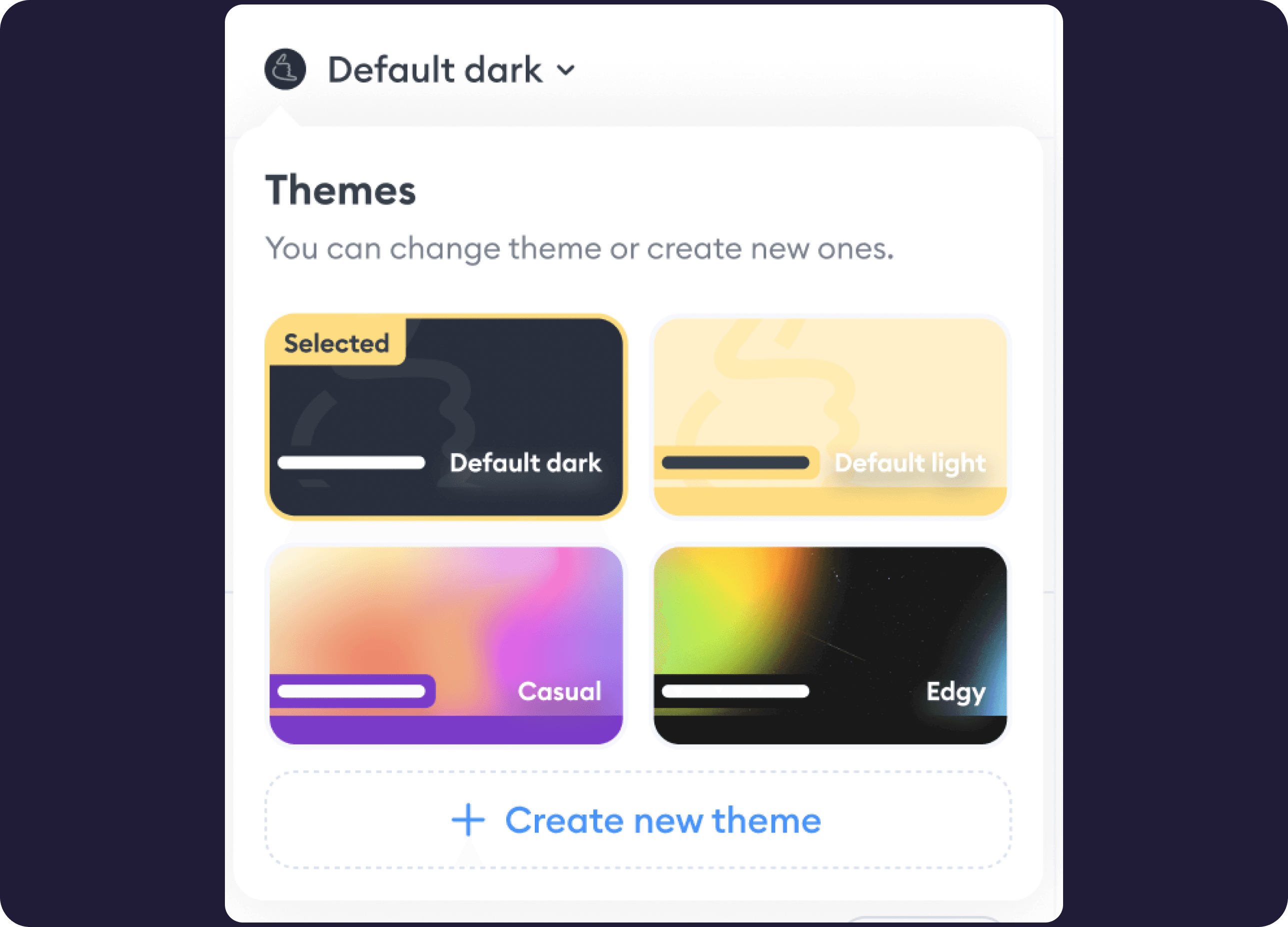
Change background
I enabled hosts to use any image or color as their background — whether it’s something that reflects their brand or one of the preset options I designed. This made the stage more vibrant and aligned with each host’s unique identity.
Change theme
I provided hosts with ready-to-use themes, giving them the flexibility to pick a pre-designed look or build their own.
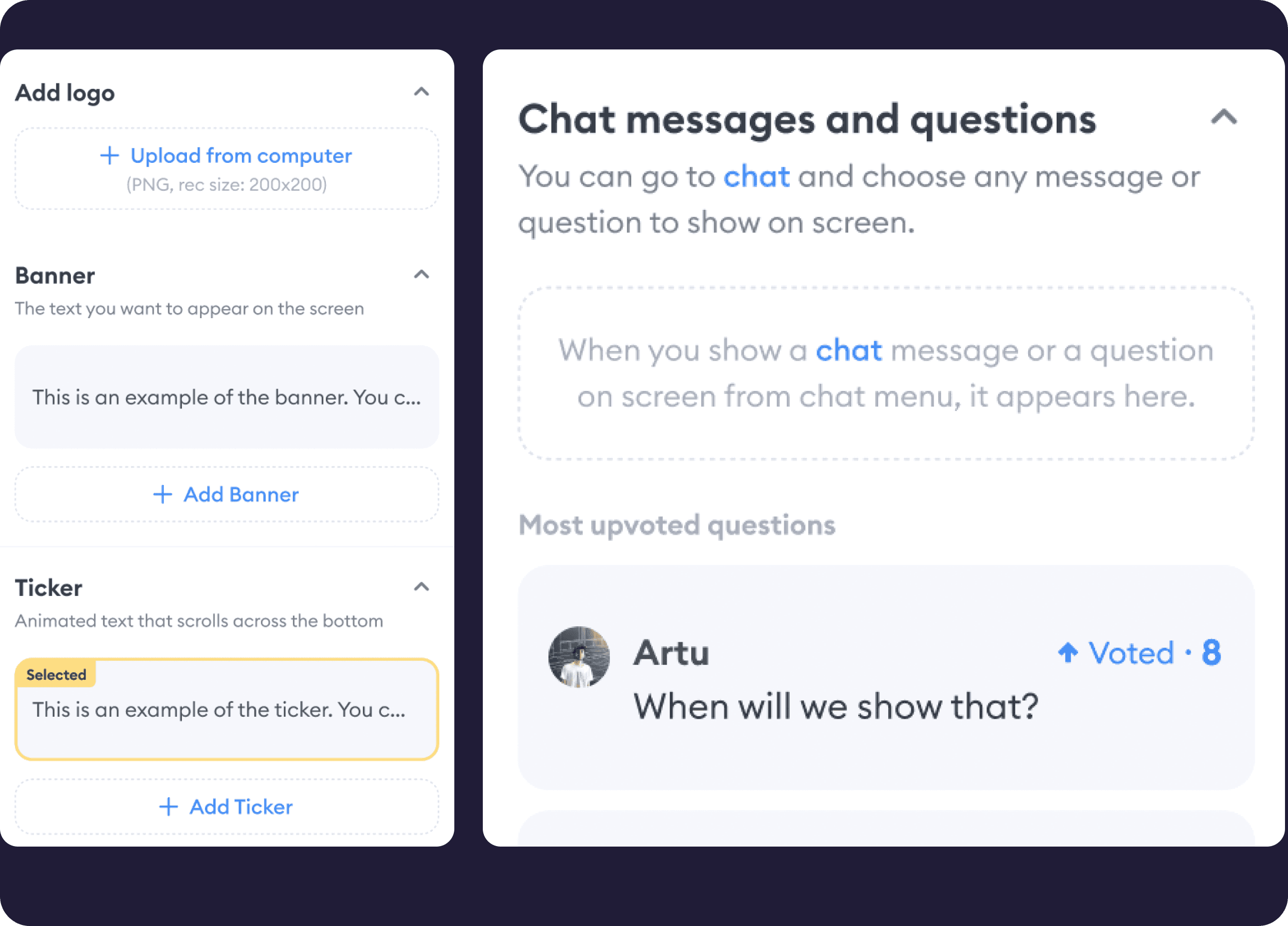
Add banner, ticker, highlight the topic
I enabled hosts to add banners and tickers, helping everyone stay aligned with the content during the broadcast.
Ask a question, add it on scene
I enabled hosts to reflect chat questions directly on the scene to boost live interaction.
Add outro, intro
I enabled hosts to add custom or ready-to-use clips — such as intros, outros, or countdowns — to enhance the visual experience and support smoother communication during the broadcast. These clips play a key role in setting the tone and guiding the audience throughout the session.
Onboarding is the key
I added an always-accessible “how-to-use” section to support users as they explore the new interface and features — in line with UX best practices.
Bring audience to scene
I designed a feature that allows the host to take the stage with a selected audience member — either someone who raised their hand or someone they choose manually. This significantly improved audience participation and made host–audience communication more dynamic.
The results
The strategic alignment and design improvements translated directly into results: a 13.25% decrease in bounce rate, a 13.47% drop in exit rate.
What I learned?
This project reminded me that good design starts way before Sketch or Figma. It starts in rooms filled with honest conversations, curiosity, and strategic intent. Failing early taught me to step back, ask better questions, and build with people, not just for them.
✨ Key Improvements
I added a personalization section within the existing panel, allowing hosts to customize themes and backgrounds to reflect their brand.
I designed an experience that allows hosts to instantly display chat messages ending with a question mark on screen — supporting stronger interaction between the host and the audience.
By repurposing the existing panel for customization, I reduced development effort while increasing flexibility for hosts.
Valid defaults
I created ready-to-use themes for hosts who don't have their own brand or branding assets. To make the experience more user-friendly, I also added default placeholder texts in the banners and tickers they can customize.
Bring audience to scene
I designed a feature that allows the host to take the stage with a selected audience member — either someone who raised their hand or someone they choose manually. This significantly improved audience participation and made host–audience communication more dynamic.
Change background
I enabled hosts to use any image or color as their background — whether it’s something that reflects their brand or one of the preset options I designed. This made the stage more vibrant and aligned with each host’s unique identity.
Change theme
I provided hosts with ready-to-use themes, giving them the flexibility to pick a pre-designed look or build their own.
Ask a question, add it on scene
I enabled hosts to reflect chat questions directly on the scene to boost live interaction.
Add banner, ticker, highlight the topic
I enabled hosts to add banners and tickers, helping everyone stay aligned with the content during the broadcast.
Add outro, intro
I enabled hosts to add custom or ready-to-use clips — such as intros, outros, or countdowns — to enhance the visual experience and support smoother communication during the broadcast. These clips play a key role in setting the tone and guiding the audience throughout the session.
Add outro, intro
I enabled hosts to add custom or ready-to-use clips — such as intros, outros, or countdowns — to enhance the visual experience and support smoother communication during the broadcast. These clips play a key role in setting the tone and guiding the audience throughout the session.
Onboarding is the key
I added an always-accessible “how-to-use” section to support users as they explore the new interface and features — in line with UX best practices.
The results
The strategic alignment and design improvements translated directly into results: a 13.25% decrease in bounce rate, a 13.47% drop in exit rate.
What I learned?
This project reminded me that good design starts way before Sketch or Figma. It starts in rooms filled with honest conversations, curiosity, and strategic intent. Failing early taught me to step back, ask better questions, and build with people, not just for them.
This project reminded me that good design starts way before Sketch or Figma. It starts in rooms filled with honest conversations, curiosity, and strategic intent. Failing early taught me to step back, ask better questions, and build with people, not just for them.