The Kızılay blood donation app
(National competition winner)
The Kızılay blood
donation app
(National competition winner)
Team work
3 people
Used by
300K+ people
Read duration
2 minutes
Before dive in..
If you want a relaxing song to accompany you, I've chosen it for you! ✨
If you want a relaxing song to accompany you, I've chosen it for you! ✨
What inspired us to enter the competition?
While browsing social media, I came across an exciting piece of news - a competition for the Kızılay blood donation application would be held. The competition was voluntary, with renowned jury members. I immediately spoke to my colleagues Oğuz Boz and Berkay Beşkök, and we became very excited. We were tasked with redesigning the blood donation application used by people in Turkey, and if we won, our application would be implemented nationwide. It was a thrilling opportunity for us! ✨
While browsing social media, I came across an exciting piece of news - a competition for the Kızılay blood donation application would be held. The competition was voluntary, with renowned jury members. I immediately spoke to my colleagues Oğuz Boz and Berkay Beşkök, and we became very excited. We were tasked with redesigning the blood donation application used by people in Turkey, and if we won, our application would be implemented nationwide. It was a thrilling opportunity for us! ✨
My role
The three of us jointly participated in the project's analysis, user experience, prototyping, and interface design. I can say that I worked a little more intensively on the interface elements of the project. Berkay worked more heavily on creating the design system, and Oğuz worked on drawing the flows.
The three of us jointly participated in the project's analysis, user experience, prototyping, and interface design. I can say that I worked a little more intensively on the interface elements of the project. Berkay worked more heavily on creating the design system, and Oğuz worked on drawing the flows.
Our approach
Before we started, we divided the project into phases. Accordingly, we set the project delivery time for these four phases: analysis, flow designs, interface design, and presentation. In the analysis phase, we used empathy maps and sketches. Using the insights we gathered from the analysis, we created the flows and proceeded to use wireframe techniques to accelerate the process. Next, we completed the interface design by creating the interface elements. Finally, we turned our work into a final presentation and submitted it to the relevant authority.
Let's get started! It's time to empathize with the user.
We started by making an empathy map. In this empathy map, we tried to answer 4 main questions. What does the user say? What is the user think? What is the user doing? What is the user feel?
Sketches
After empathizing with the user, we sketched an interface and flow that would align with their preferences and experiences based on our findings.
Wireframe phase
We visualized the pages we drew during the wireframe phase using Miro and started to extract the flows.
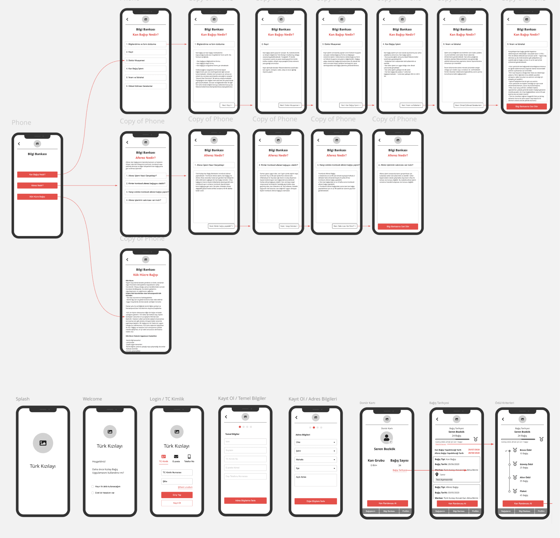
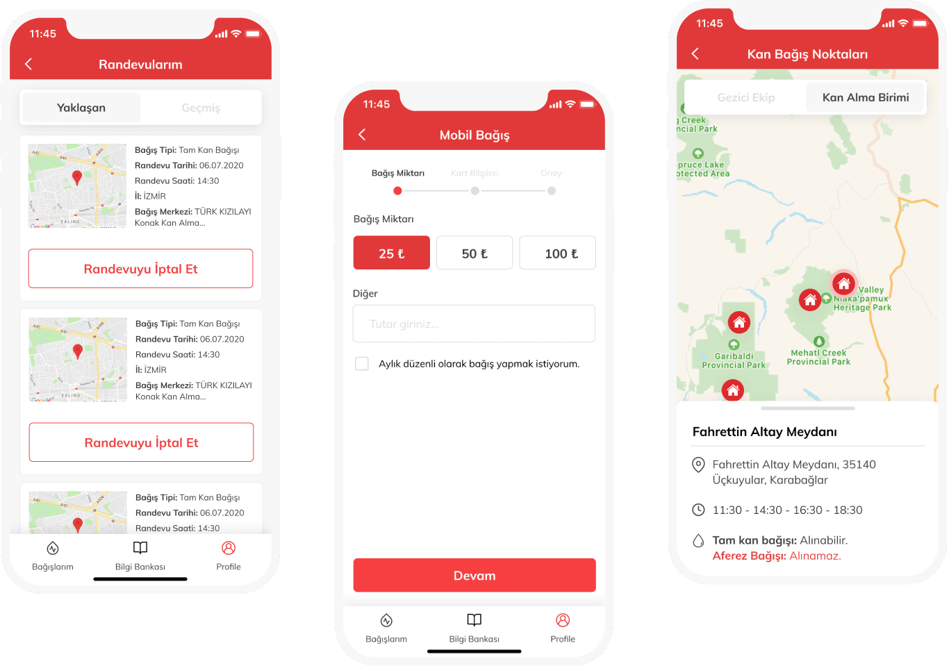
Showcase
You can see some pages of the app.
File management and presentation
Before submitting the work to the competition, we created a certain order in Figma. We grouped the pages as empathy map, sketch, wireframe, user flow, style guide, screens, and finally, presentation. In order to explain our most recent work, we reserved the last page for the presentation and delivered it that way. After finishing all the work, all that remains is waiting for the result of the competition with excitement!
And..we won the contest! 🏆
At the end of this project, we were awarded the 1st prize. As a team, we redesigned the blood donation application used by more than 300,000 people all over Turkey. We learned how important teamwork is and how great it feels to achieve success with a team in such a large-scale project!

Highlights
The user says "I'm curious about the marrow transplant processes."
The user thinks "I wish I could generate a value that would work".
The user frequently uses mobile apps.
The user feels happy when they help people.
Our approach
Before we started, we divided the project into phases. Accordingly, we set the project delivery time for these four phases: analysis, flow designs, interface design, and presentation. In the analysis phase, we used empathy maps and sketches. Using the insights we gathered from the analysis, we created the flows and proceeded to use wireframe techniques to accelerate the process. Next, we completed the interface design by creating the interface elements. Finally, we turned our work into a final presentation and submitted it to the relevant authority.
Let's get started! It's time to empathize with the user.
We started by making an empathy map. In this empathy map, we tried to answer 4 main questions. What does the user say? What is the user think? What is the user doing? What is the user feel?
Sketches
After empathizing with the user, we sketched an interface and flow that would align with their preferences and experiences based on our findings.

Wireframe phase
We visualized the pages we drew during the wireframe phase using Miro and started to extract the flows.
Based on UX heuristic rules
What was the problem?
The density of the appointment screens made it difficult to make an appointment as well as the countdown structure and different visual languages on the mobile donation screens were disrupting the integrity of the application. All of these design flows were made for an application that was not user-friendly.
How we solved it?
In the current application, the processes that create obstacles to the user flow have been improved, registration has been facilitated, mobile donation processes are clearly transferred to the user, enabling them to see and understand the stages of progress. The reward system has been established with a structure that can be understood instinctively by keeping it simple. A friendly language has also been created with illustrations.
Before and after
Problem
Although it is very useful to classify the input fields in separate pages due to the excessive information requested from the user during the sign-up process, there is no process bar usage.
UX heuristic
Visibility of system status, Aesthetic and minimalist design.
Solution
Using the process bar at the top of the page, we show the user how many more steps they need to complete. Also we preferred a simple and minimal interface throughput

Before and after
Problem
When we want to make a blood appointment within the existing application, we can only see what the blood donation is in the information bank tab. However, we need to consume this information before I get a blood appointment.
UX heuristic
Help and documentation
Solution
In addition to the blood donation and apheresis donation tabs detailed in the information bank, what is apheresis to the user before making a blood appointment? what is blood donation? We give a brief information about. In this way, we inform the user before making a blood appointment.
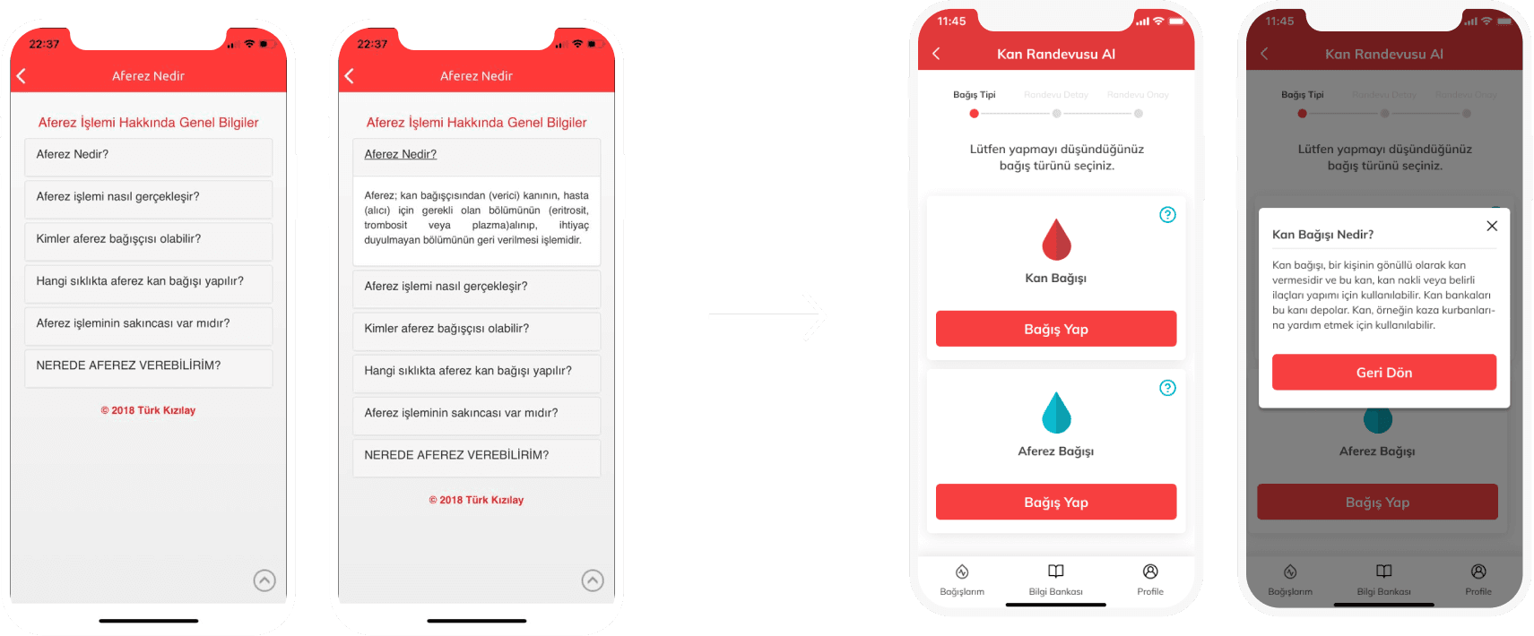
Before and after
Problem
The knowledge base consists of many articles and fields. It is not a right choice to leave the user with so much writing.
UX heuristic
Flexibility and efficiency of use.
Solution
The contents of the information bank are classified, allowing the user to access the explanations of the questions on the relevant tab within a single page.

Before and after
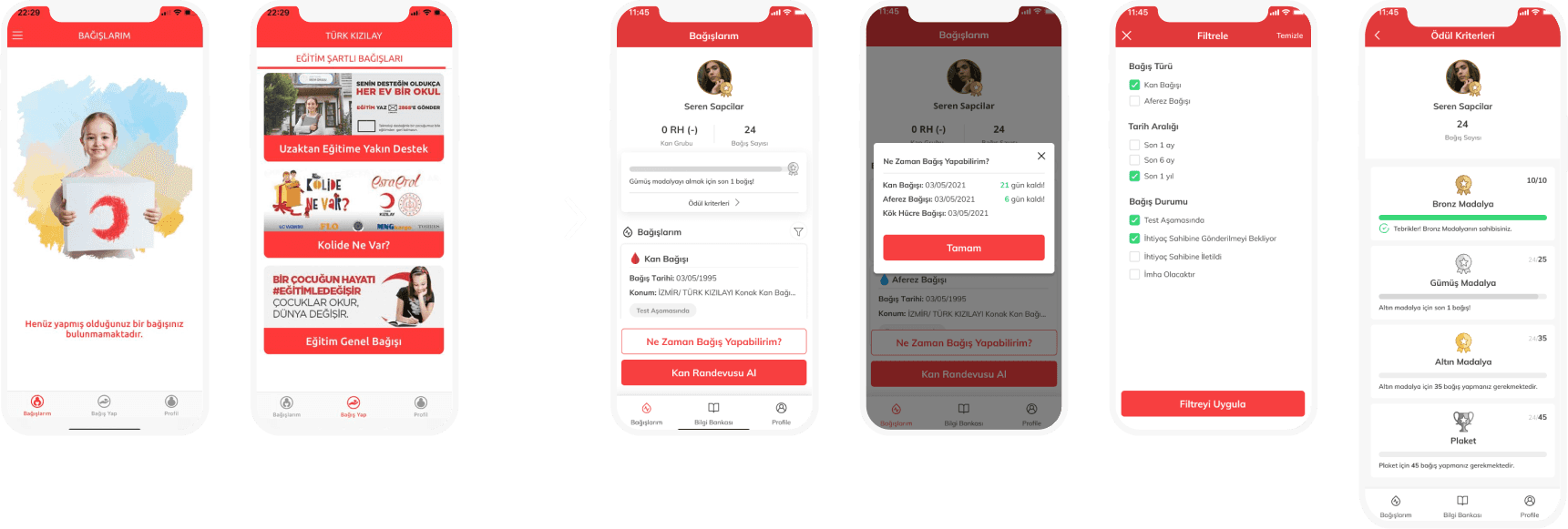
Problem
Only donations made are listed in the my donations tab. When I want to donate, I have to switch to a side tab.
UX heuristic
User control and freedom
Solution
The My Donations tab is designed in homepage logic. The user can easily access the details of the blood type, the number of donations made, the date of blood appointment, the donation date, and the awards from this page. He can easily reach his searches by filtering his donations.
Highlights
The user says: "I'm curious about the marrow transplant processes."
The user thinks "I wish I could generate a value that would work".
The user frequently uses mobile apps.
The user feels happy when they help people.
Highlights
The user says: "I'm curious about the marrow transplant processes."
The user thinks "I wish I could generate a value that would work".
The user frequently uses mobile apps.
The user feels happy when they help people.
Sketches
After empathizing with the user, we sketched an interface and flow that would align with their preferences and experiences based on our findings.
Wireframe phase
We visualized the pages we drew during the wireframe phase using Miro and started to extract the flows.
Based on UX heuristic rules
What was the problem?
The density of the appointment screens made it difficult to make an appointment as well as the countdown structure and different visual languages on the mobile donation screens were disrupting the integrity of the application. All of these design flows were made for an application that was not user-friendly.
How we solved it?
In the current application, the processes that create obstacles to the user flow have been improved, registration has been facilitated, mobile donation processes are clearly transferred to the user, enabling them to see and understand the stages of progress. The reward system has been established with a structure that can be understood instinctively by keeping it simple. A friendly language has also been created with illustrations.
Before and after
UX heuristic
Visibility of system status, Aesthetic and minimalist design.
Problem
Although it is very useful to classify the input fields in separate pages due to the excessive information requested from the user during the sign-up process, there is no process bar usage.
Solution
Using the process bar at the top of the page, we show the user how many more steps they need to complete. Also we preferred a simple and minimal interface throughput
Before and after
UX heuristic
Help and documentation
Problem
When we want to make a blood appointment within the existing application, we can only see what the blood donation is in the information bank tab. However, we need to consume this information before I get a blood appointment.
Solution
In addition to the blood donation and apheresis donation tabs detailed in the information bank, what is apheresis to the user before making a blood appointment? what is blood donation? We give a brief information about. In this way, we inform the user before making a blood appointment.
Before and after
UX heuristic
Flexibility and efficiency of use.
Problem
The knowledge base consists of many articles and fields. It is not a right choice to leave the user with so much writing.
Solution
The contents of the information bank are classified, allowing the user to access the explanations of the questions on the relevant tab within a single page.
Before and after
UX heuristic
User control and freedom
Problem
Only donations made are listed in the my donations tab. When I want to donate, I have to switch to a side tab.
Solution
The My Donations tab is designed in homepage logic. The user can easily access the details of the blood type, the number of donations made, the date of blood appointment, the donation date, and the awards from this page. He can easily reach his searches by filtering his donations.
Before and after
UX heuristic
Flexibility and efficiency of use.
Problem
The knowledge base consists of many articles and fields. It is not a right choice to leave the user with so much writing.
Solution
The contents of the information bank are classified, allowing the user to access the explanations of the questions on the relevant tab within a single page.
Before and after
UX heuristic
User control and freedom
Problem
Only donations made are listed in the my donations tab. When I want to donate, I have to switch to a side tab.
Solution
The My Donations tab is designed in homepage logic. The user can easily access the details of the blood type, the number of donations made, the date of blood appointment, the donation date, and the awards from this page. He can easily reach his searches by filtering his donations.
Showcase
You can see some pages of the app.
File management and presentation
Before submitting the work to the competition, we created a certain order in Figma. We grouped the pages as empathy map, sketch, wireframe, user flow, style guide, screens, and finally, presentation. In order to explain our most recent work, we reserved the last page for the presentation and delivered it that way. After finishing all the work, all that remains is waiting for the result of the competition with excitement!
And..we won the contest! 🏆
At the end of this project, we were awarded the 1st prize. As a team, we redesigned the blood donation application used by more than 300,000 people all over Turkey. We learned how important teamwork is and how great it feels to achieve success with a team in such a large-scale project!
The Kızılay blood donation app
(National competition winner)
Superpeer Studio
Next case
Based on UX heuristic rules
Before and after
What was the problem?
The density of the appointment screens made it difficult to make an appointment as well as the countdown structure and different visual languages on the mobile donation screens were disrupting the integrity of the application. All of these design flows were made for an application that was not user-friendly.
How we solved it?
In the current application, the processes that create obstacles to the user flow have been improved, registration has been facilitated, mobile donation processes are clearly transferred to the user, enabling them to see and understand the stages of progress. The reward system has been established with a structure that can be understood instinctively by keeping it simple. A friendly language has also been created with illustrations.
Problem
Although it is very useful to classify the input fields in separate pages due to the excessive information requested from the user during the sign-up process, there is no process bar usage.
Solution
Using the process bar at the top of the page, we show the user how many more steps they need to complete. Also we preferred a simple and minimal interface throughput
UX heuristic
Visibility of system status, Aesthetic and minimalist design.
Showcase
You can see some pages of the app.